Brutalist “raw” design, the new beauty.

The tendency to return “to what used to be” is a constant presence in industrial design, graphic design, fashion design and cinema. We are human beings and we are nostalgic by nature. The concept of “raw” is also applied in gastronomy, it is the tendency to eat raw food. Raw Design, seeks to generate “rough” designs, which are notable for the lack of purification and refinement, are designs that are born from the visceral and primitive, and there is no intention to make them look nice and clean. Web design always marks a trend, since the first webs were created with technologies compared to those of today, primitives, those pages that seemed to be designed in Word, rigid and for some people ,“ugly”, with the new technologies, web design has been transformed, and every year a trend is highlighted.
“Brutalism” (or “New Brutalism”) is a term which has been rattling round architectural schools for over half a century. It refers to a raw form of architecture with characteristics such as rough unfinished surfaces, unusual shapes, solid materials (like concrete), massive forms, and contrasting small features.

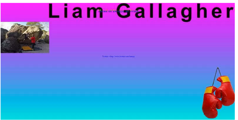
The new trend right now is a design style that has been called “Brutalist”, or “Raw”, which evokes this architecture style and those early days of web design, and leaves out the structured and minimalist design. Again it brings the saturated colors, the crude typographies and the exaggerated and meaningless composition.
System fonts like monotype abound, bold and extra bold, as well as glitch images, black and white on color, and palettes incoherent with each other. Also seen are gradients, and animated gifs.
They move away from ordered structures, which seem to respect no grid, but defy every possible rule.
They evoke windows of early windows OS, and code editors, using that feature to highlight or contain information. Sometimes they refer to pop icons, or brands that emerged in the 1980's and 1990's.


The idea is to generate visual chaos, which in turn expresses beauty and shows only the essentials of information, or on the contrary extreme, saturate the viewer. Sometimes these designs even cause discomfort and bewilderment. I believe that it seeks to generate an immediate impact on the visitor, risking his criteria, but calling his attention undoubtedly, either because the website made a good impression, or because it seemed unpleasant, but we can not help but recognize that we can not overlook these sites.
(Source of images: https://1stwebdesigner.com)
